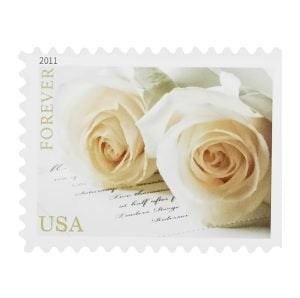
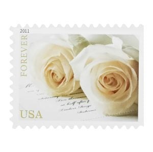
Couples spend months on a coherent visual language — paper, palette, typography — and then choose the stamp from whatever is in stock that week.
It is the last element the guest sees before opening, and matching it to the wedding rather than to the calendar takes about ten minutes.
By style
Rustic. Woodland elements, wildflowers, sunflowers, lavender. Muted tones — sage, ivory, blush. Avoid anything with a metallic finish; it fights the paper.
Modern. Clean lines, geometric forms, minimal floral treatments. Bold single colours or restrained metallics. A busy stamp undoes a minimal suite faster than anything else on the envelope.
Classic. Roses, delicate linework, soft pastels and champagne tones. Traditional symbols read as intended here rather than as cliché.
Coastal. Shells, watercolour blues, sandy neutrals. Watercolour treatments in particular sit well against the light stock these suites usually use.
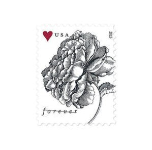
Vintage. Antique floral patterns, sepia tones, engraved or lace-like detail. Older retired issues are often a better match here than anything currently in print — which is a rare case where buying surplus is the aesthetic choice as well as the cheaper one.
Four practical checks before ordering
- Check it against your actual envelope. Buy one sheet first. Pale designs vanish on dark or textured stock, and you cannot tell from a product photograph.
- Check the size. Some commemorative issues are physically larger than a definitive. On a small or unusually shaped envelope, that matters.
- Check the postage before the design. Assembled suites frequently exceed one ounce, and squares and wax seals trigger the non-machinable rate. Settle the rate first — it may restrict which designs are even available at that value.
- Order early. Wedding and floral issues sell out, and a design that disappears mid-mailing means switching partway through.
On contrast
The choice most people get wrong is tonal. A stamp that matches your envelope colour exactly disappears; a stamp that contrasts too hard looks stuck on.
The usual answer is one step of contrast — a stamp a shade or two deeper than the envelope, in a related hue. It reads as chosen rather than as either camouflage or collision.
Where to buy
The USPS official store for current wedding and two-ounce issues, or a verified surplus channel such as Forever Stamp Center for retired designs — particularly for vintage-styled suites, where older issues fit better.
The short version
Settle the postage rate first, then choose a design that suits the wedding's style rather than the month it falls in, test it on your real envelope, and order it early enough that the design still exists when you need it.
More on buying Forever stamps
- 👉 Assemble One Invitation and Take It to the Counter
- 👉 Choosing a Flower Stamp by What the Flower Means
- 👉 180 Invitations With Reply Cards Is $280.80 in Postage

Currently working at USPS in Chicago, he has more than 15 years of experience in bulk mailing and logistics. His columns focus on Forever Stamp trends, helping businesses and individuals make cost‑effective mailing decisions.
